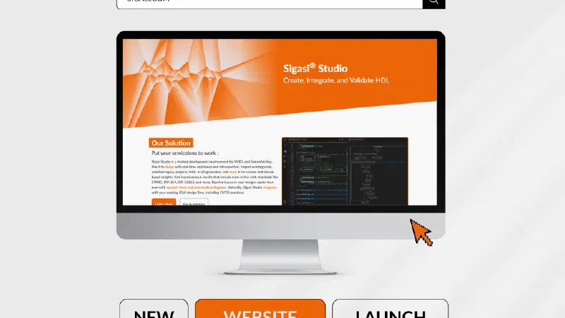
Sigasi Unveils a New Look and Feel
We’re delighted to announce our new look and feel, including a new logo
Our new logo design puts our core business front and center: improving HDL development.

The modernized outline text of our logo is punctuated by two i’s stylized to look like the semicolons that are crucial to hardware design specifications. It visually symbolizes the sector in which we’re leaders. Our new tagline makes it explicit: we help hardware engineers and designers get the most out of their “semicolons.”
Given that our logo is a wordmark, where our name is our logo, we carefully chose Fira Code as our font. Why? Because it’s a top coding font, thanks to its x-height, ligatures, and monospacing—all elements that reduce eye strain and improve workflow. (Don’t just take our word for it .) Using this font with a few special twists in our logo, we’re directly referencing our belief in quality products that make engineers’ lives easier, from fonts to IDEs.
Our refreshed look and feel underscores our commitment to a new era of chip development that prioritizes user experience and unwavering design integrity. Sigasi empowers hardware engineers to achieve excellence in HDL creation, integration, and validation—now with a fabulous new appearance.
2024-04-16